Bar charts are the workhorse of technical analysis. The majority of charts you will see in books, magazines, and online will be bar charts, so it pays to learn what each component means.
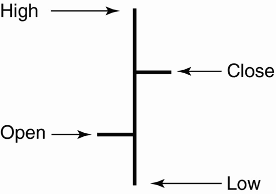
The “bar” in bar chart is a vertical line in which the top denotes the high price of the period and the bottom denotes the low. Off on the left of the bar is a horizontal line denoting the opening price and off on the right is another horizontal line denoting the close. A bar therefore includes all four of the key price components — the open, high, low and close, sometimes abbreviated OHLC.
All software allows you to stipulate how much time you want your bar to encompass. You can have 5-minute bars, 15-minute bars, 1-hour bars, 4-hour bars, etc. In Forex, the most commonly used bars are the 15-minute, 1 and 4-hour, and daily. Be careful to seek out the time parameter of the bars on a new chart prepared by someone else. Unless a chart is labeled otherwise, you are usually safe assuming a chart is of daily bars.
 The Four Bar Components
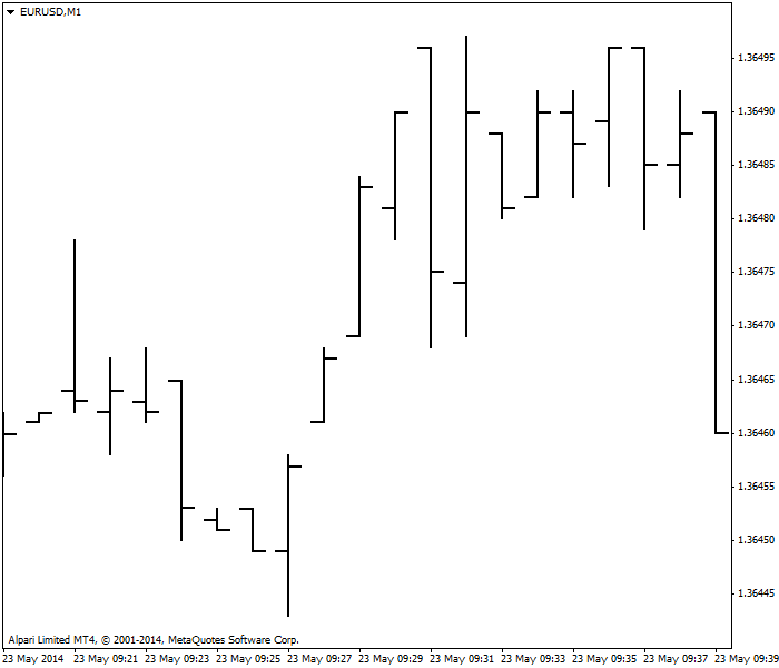
The open refers literally to the first price at which a trade is actually done in the period. Usually the open is the same or very close to the previous close, but the open can be important if it is far away from the close of the previous period, and especially if the open is a gap. The chart below shows EUR/USD M1 chart with quite a few opening gaps up and down. We can assume that they are caused by either high market volatility or lack of liquidity at some price points.
Note that we get very few opening gaps on timeframes higher than 1-minute in Forex because of near-continuous trading. The only real opportunities for significant gapping are (1) the period between the end of the Chicago futures pit session and the re-opening of the Globex session two hours later — when the spot market is not closed down during that window and (2) from the Friday close in New York to the Asian open late Sunday afternoon (morning in Asia) — a weekly gap.
The close is the last trade done within the timeframe you name for your bar definition. It is the most important data point on the bar because it summarizes the final sentiment of the period.
- Negative sentiment: the close is
- Below the open
- At or near the low
- Positive sentiment: the close is
- Over the open
- At or near the high
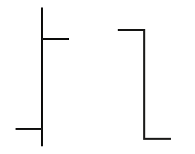
Back in the first figure, you can notice that the second bar's open is at the high and the close is at the low. Open-at-high and close-at-low is a message that something happened during the day to turn sentiment against this security. The chances are good that the following bar will contain a lower low and therefore that a short position should be considered. Conversely, a bar that opens at the low and closes at the high is a suggestion that the next period’s trading will see a rise.
Bar Size
In addition to the placement of the components, the size of the bar matters, too. A tiny bar (small distance between high and low) means a lack in interest by both buyers and sellers. A tall bar, with a wide distance between the high and the low, means a lot of buying and selling interest.
The distance between the high and low is named the trading range and an oddball bar that is different in size or component configuration from the bar preceding it should get attention.
- A particular pattern to watch out for is a series of small-range bars, say 40 points tall, when the average high-low range has been averaging 65 points. A series like this usually implies a lack of decisiveness and will be resolved by a breakout in one direction or the other. If you have an idea about what might inspire a breakout, such as an upcoming news release, you can position ahead of time.
- Another pattern is a series of large-range bars, implying that the trading action is fast and furious. "Large-range" is defined as substantially bigger than the average, say 160 points when the average is 100. Traders cannot keep trading in such a wide range — intraday losses are too big, and besides, fast-and-furious trading uses up adrenaline. Traders literally become exhausted at such a pace. Be careful about entering a market with above-average sized bars. It can fizzle.
Placement of the Bar in a Series
As noted above, we can make assumptions about the sentiment hidden in a bar partly on what bar patterns came before it. In fact, one definition of an uptrend is a series of bars containing higher highs and higher lows in a preponderance of bars, and a downtrend is a series containing lower highs and lower lows. Note that word preponderance. It mean a majority of bars, not every single bar. It is up the analyst to decide how many bars have to qualify as a preponderance before calling a move a trend. On a daily chart, we would say that 5 out of 7 would suffice.
Comments